How to make your customers spend more without raising prices
1. You don't sell products, you sell decisions
A customer who opens your menu doesn't want to think too much. They want to decide quickly: "What should I order?"
If your menu is flat—a list without hierarchy—you are leaving the decision to chance. And when that happens, the customer tends to choose the cheapest or the most familiar option. Result: a low average ticket.
On the other hand, when you structure the menu to direct their gaze, you start to influence what they choose.
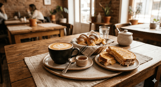
2. What is seen first, sells the most
Not all products should carry the same visual weight. There are products you want to push:
- Combos
- High-margin dishes
- Extras
- "Star" products
If everything is presented the same way, nothing stands out. However, when you start using attractive images, clear titles, and small highlighted blocks, you automatically change the customer's behavior. Not because you force them, but because you make the decision easier for them.
3. The power of combos (well displayed)
A well-put-together combo increases the ticket almost without friction. But there is a key detail: it’s not enough for it to exist, it has to be noticed.
If the combo is lost in the list, it doesn't work. On the other hand, when you present it as a highlighted option—with an image, a clear name, and a small incentive ("ideal for sharing," "most ordered," etc.)—it becomes an easy decision. The customer doesn't compare as much, they simply choose.
4. Strategic spaces within the menu
Think of your menu as a storefront window. It's not all just a list. You can also have highlighted sections, blocks that interrupt the reading flow, and spaces where you "push" certain products.
This type of structure works almost like internal advertising. It is not invasive, but it is effective: it directs attention exactly where you want it.
That is where a more advanced digital menu logic begins to emerge: not just showing, but strategically ordering what the customer sees first and what stays in the background.
5. Short text, but with intention
A well-used description sells more than a dry list. You don't need to write a lot. You just need to write better.
Examples:
- "Our most ordered"
- "Perfect for a complete snack"
- "Ideal if you're really hungry"
That little push reduces doubt. And less doubt = faster decision = higher spending.
6. When the menu starts working for you
All of this makes sense logically, but in practice, many menus don't apply it because they lack an easy way to do so. That’s where a more interesting layer comes in: using tools that allow you to design the menu with intention, not just upload products.
For example, highlighting combos or promotions along the customer's journey, incorporating visual blocks that work as "internal ads," combining image and text to guide decisions, and ordering products based on strategy rather than just category.
When you can do that easily, the menu stops being static and becomes a real sales tool. And this is exactly the kind of logic being incorporated today by solutions like Menuxify, where you not only show what you sell, but you also decide how to show it and what you want the customer to see first. Without friction, but with intention.
Conclusion
You don't need to raise prices to increase revenue. You need to guide the decision better, highlight what is most profitable for you to sell, reduce customer doubt, and make choosing easy.
Because in the end, the customer doesn't buy more expensive... they buy better when the menu guides them. And if the menu is well thought out, an increase in the average ticket stops being a matter of luck and becomes a strategy.